February 20th, 2013 at 8:55 pm (History, Language, Library School, Vocabulary)
If I thought about it at all, I assumed that upper case and lower case were just two different cases (options) for big, or small, letters. You might therefore assume that these terms have been with us since the invention of writing, or at least writing in two sizes.
Not so!
These terms came into being with the invention of moveable type and the printing press (1450 A.D.). Typesetters would pick letters from a large case organized by letter. And — you guessed it — capital letters were in the “upper case” and the rest were in the “lower case.” The terms referred to their physical location, which quickly became convention, because then a typesetter from one press could quickly adapt to another press. Yet now the terms are so generic that they are used even in handwriting instruction. The printing press’s influence echoes down the ages!
Notice the upper-case letters had slots of equal size, while the lower-case letters (more often used) had slots proportional to their frequency of use (in English). This is what you’d need when setting a single line of type.


There were already existing terms for the two cases. Capital letters were referred to as “majuscules” and small letters were “minuscules.” But such was printing’s influence that the jargon of the trade has spread out to general use. Also, scripts that have two sizes, like this, are referred to as “bicameral” scripts (just like bicameral government!).
I learned about this in “The Coming of the Book: The Impact of Printing 1450-1800” by Febvre and Martin, which I am reading for a library school course on the history of books and libraries. This book contains other interesting tidbits, like the fact that once the printing press got going, it was very productive; skilled teams could produce a sheet every 20 seconds. Further, there’s a sordid and fascinating story behind Gutenberg and his associates Fust and Schoeffer, who took over his printing press just as he was finalizing the process, because Gutenberg defaulted on a loan; as a result, none of the books printed with his press bear his name as the publisher, although the history books have given his name full credit.
Nowadays even fonts displayed digitally continue the use of “upper” and “lower” case to distinguish these two components of the English script. The very term “font” is also an echo of early printing press technology developments, as it comes from “fondue” which means something that has been melted; early fonts were cast in metal at a type foundry. Can we imagine “tweet” or “text” or “facebook” persisting in our vocabulary for a similar span of more than 500 years?
4 Comments
4 of 4 people learned something from this entry.
February 8th, 2013 at 2:45 pm (Animals, Books, History, Library School)
In my class on the History of Books and Libraries, we were recently introduced to this fun 9th century Irish poem. My own cat and I are amused.
The cat’s name, Pangur Bán, is a little tricky to decode. “Bán” means “white,” and “Pangur” seems to have been a common name for cats (maybe like Felix) that may mean “Fuller” (as in fulling cloth: beating it to remove dirt and impurities — like how cats knead blankets?).
I and Pangur Bán, my cat
‘Tis a like task we are at;
Hunting mice is his delight
Hunting words I sit all night.
Better far than praise of men
‘Tis to sit with book and pen;
Pangur bears me no ill will,
He too plies his simple skill.
‘Tis a merry thing to see
At our tasks how glad are we,
When at home we sit and find
Entertainment to our mind.
Oftentimes a mouse will stray
In the hero Pangur’s way:
Oftentimes my keen thought set
Takes a meaning in its net.
‘Gainst the wall he sets his eye
Full and fierce and sharp and sly;
‘Gainst the wall of knowledge I
All my little wisdom try.
When a mouse darts from its den,
O how glad is Pangur then!
O what gladness do I prove
When I solve the doubts I love!
So in peace our tasks we ply,
Pangur Bán, my cat, and I;
In our arts we find our bliss,
I have mine and he has his.
Practice every day has made
Pangur perfect in his trade;
I get wisdom day and night
Turning darkness into light.
Translation by Robin Flower
Comments
February 2nd, 2013 at 10:36 pm (Exercise, Health, History)
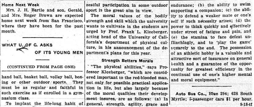
 While scanning old newspapers for the library, I came across this Monrovia Daily News article from August 23, 1915. The University of California announced its standards for its incoming freshmen in terms of their physical fitness and abilities. But it’s more than being fit — the word “moral” appears throughout the article, and it is emphasized as if obvious that being physically fit leads to moral fiber as well. Wow!
At any rate, I was amused to discover that the *only* items on the list that I would be able to perform are two of the swimming ones: to swim 50 yards (note there is no time limit specified) and to dive from a height of five feet. The others are well beyond my physical ability.
On the other hand, if they had been imposed as requirements at some point, maybe I would have worked to achieve them!
So, do you measure up? Can you imagine if this were required of freshmen today?

2 Comments
2 of 2 people learned something from this entry.
January 29th, 2013 at 8:57 pm (Books, History, Library School)
 My class on the History of Books and Libraries started off with a tour of ancient writing systems and libraries. We covered a wealth of fascinating content. For example, it had never occurred to me that the Lascaux cave paintings were three-dimensional, since they were painted onto irregular cave walls! I’d only ever seen flat-looking 2D pictures like the one at right. Today you can visit the Lascaux cave paintings in 3D through the magic of the Internet. Do it! I sat there enthralled as I floated through the twisty little passages and came away with an entirely different sense of this early artwork. “Early” is an understatement. The paintings are estimated to be 17,000 years old!
I also learned that cuneiform tables had a 3D aspect not only in their wedge-shaped impressions but because, as chunks of clay, they were rather thick, and scribes took advantage of this to write on all sides, including the edges. Browse all sides of real tablets yourself! (Now I want to make my own, maybe out of Play-doh.)
 We discussed various writing systems, and you can browse several historical scripts as well as (quite curiously) constructed scripts, mainly for English, that replace our current alphabet. One of my favorites is Heptal (rendered at right). We also discussed boustrophedon, a word I will never again misspell.
Finally, we covered the ancient libraries at Nippur, Ur, Nineveh, and Alexandria. The library at Nineveh was the creation of Ashurbanipal and grew to contain 30,000 clay tablets, with a complex indexing system and integrated book curses. My assignment for this week was to create a “learning activity” about Ashurbanipal and his library.
Dare you take my quiz? Will you earn yourself Ashurbanipal’s admiration or his scorn?
1 Comments
1 of 1 people learned something from this entry.
November 12th, 2012 at 11:03 pm (History, Literature)
The question is ill-formed, since Watson never existed outside of Sir Arthur Conan Doyle’s pages, which clearly indicate that he was a man. And yet… and yet… this tongue-in-cheek analysis of Watson’s gender is so delightfully entertaining that who cares whether the question makes sense? Read on. Read the case to support the claim that Watson was a woman.
P.S. I learned from this talk that there are a total of 60 Sherlock stories. What! I must have missed some of them. Time to go a-hunting.
Comments


 My class on the History of Books and Libraries started off with a tour of ancient writing systems and libraries. We covered a wealth of fascinating content. For example, it had never occurred to me that the Lascaux cave paintings were three-dimensional, since they were painted onto irregular cave walls! I’d only ever seen flat-looking 2D pictures like the one at right. Today you can
  We discussed various writing systems, and you can